Starborne: Sovereign Space
MMORTS PC Strategy Game
- Client: Solid Clouds (Reykjavík)
- Role: Lead UX/UI Designer
- Timeframe: 2017 – 2021
In September 2017 I joined Solid Clouds in Reykjavík as the dedicated UX/UI Designer for Starborne: Sovereign Space, a interface heavy large-scale PC strategy game. My role was to establish the game’s UI framework and guide its evolution through the transition from Alpha to Beta.
My work included creating wireframes and prototypes, building reusable UI components, and developing a colour palette and design system to ensure consistency across the game. I also produced the complete set of in-game icons, along with supporting logos and graphic illustrations.
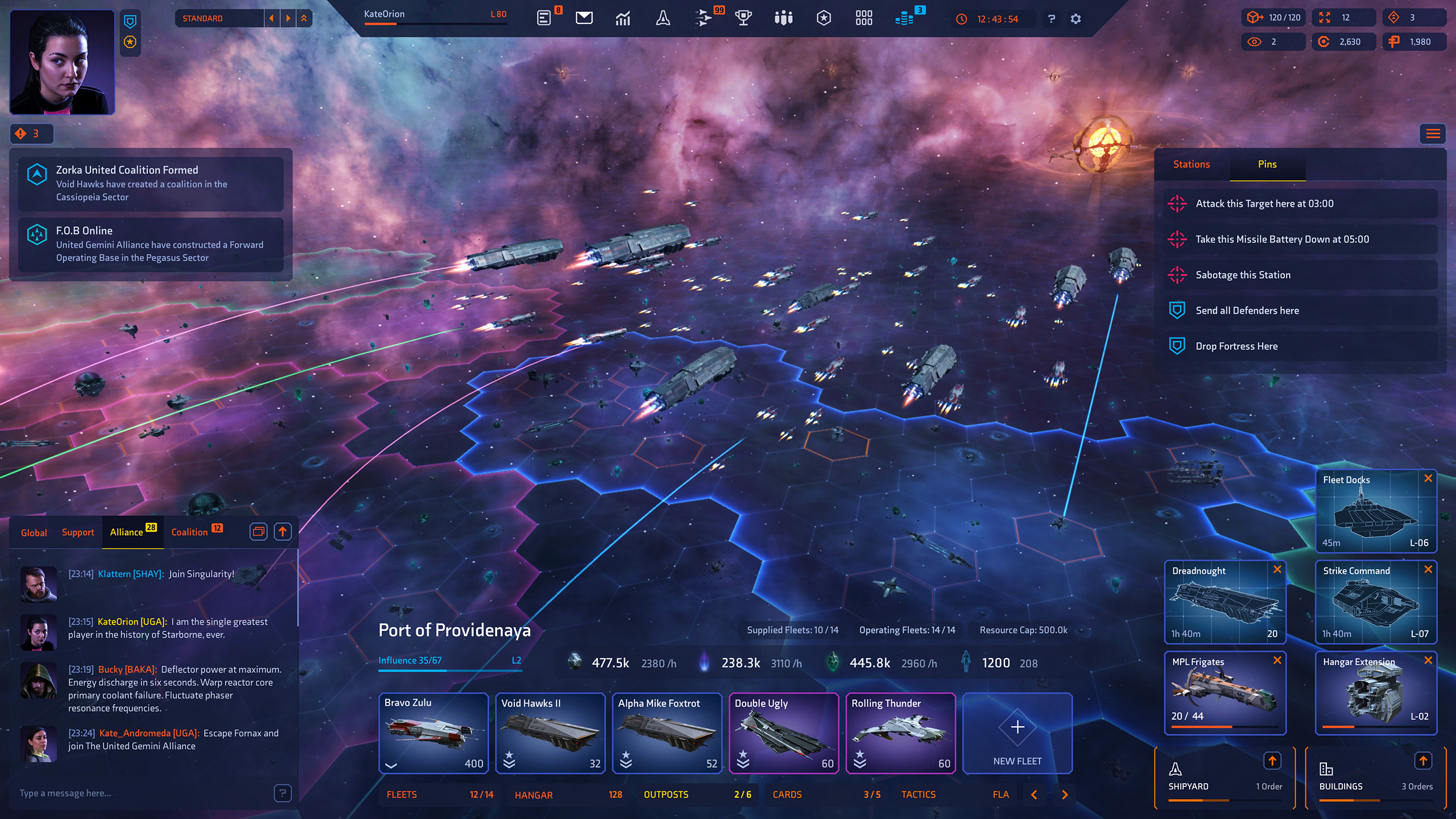
HUD / HUD Components
The HUD served as the primary layer of interaction within Starborne, acting as the top-level panel from which every other system could be accessed. It brought together essential functions such as chat, notifications, and the top navigation bar, alongside a live empire overview. Central to this design were the Station Manager and Production Queues, giving players immediate visibility into construction and resource flow without breaking immersion.
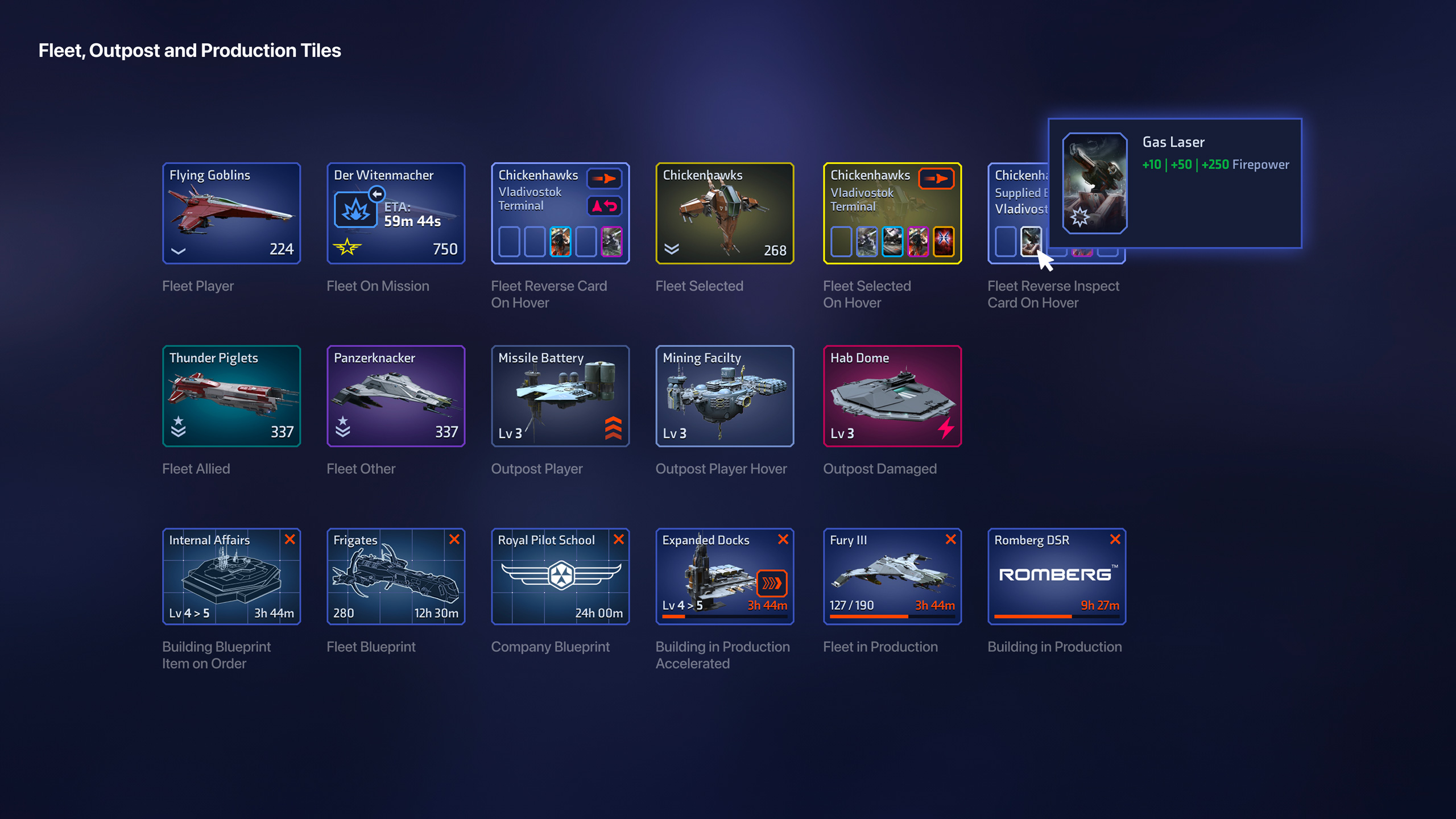
Tiles were the main touchpoint between players and the game world, each representing a fleet, outpost or production queue. They provided a way of showing status at a glance, whether a fleet was idle, selected or on mission, an outpost was damaged or producing resources, or a building was under construction. The challenge was to keep this variety visually consistent while making states immediately clear.
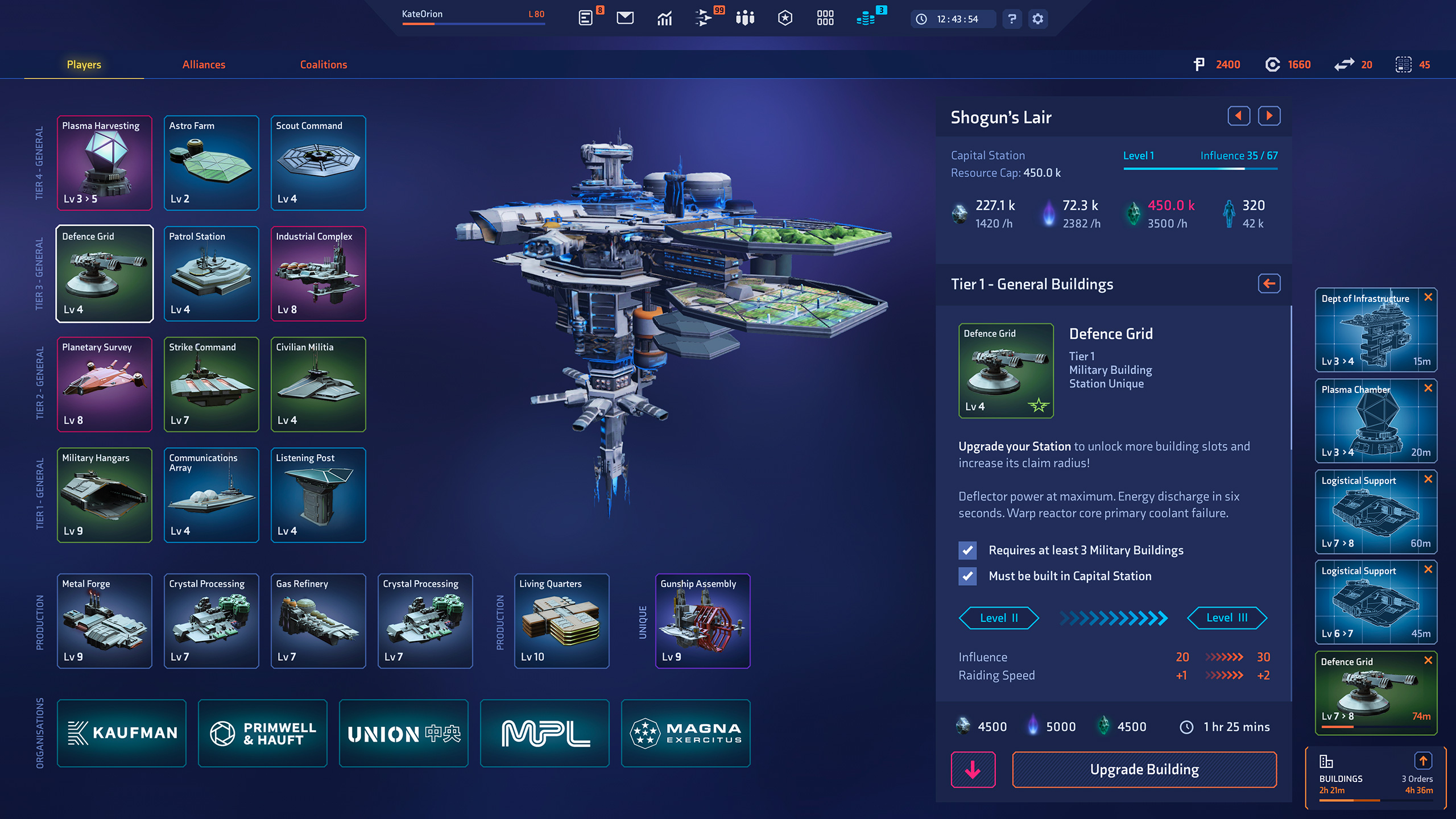
Building Planner
The Building Planner gave players control over how to shape each station, defining its role as industrial, military, or commercial. This was achieved by levelling the station and filling available building slots to create tailored configurations. It was equally important to provide a clear view of what was already constructed, as well as quick navigation between multiple stations. The design balanced strategic depth with clarity, ensuring players could plan long-term while still managing day-to-day upgrades efficiently.
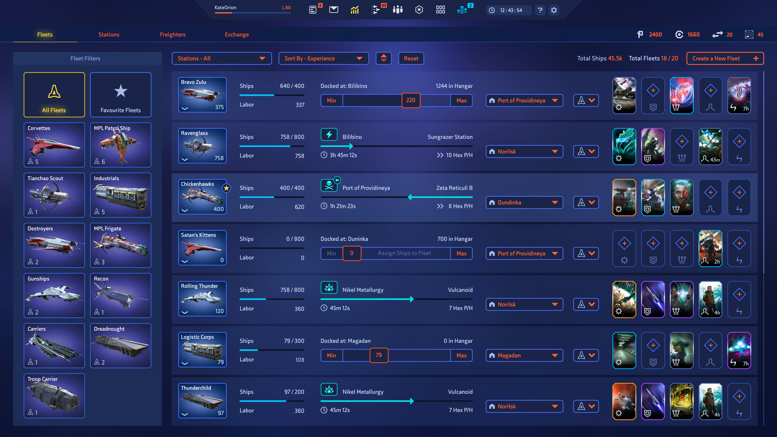
Fleet Manager
The Fleet Manager gave players a clear overview of all fleets and their current activities. Fleets could be filtered by type or sorted by size, experience, or station. It also acted as the control point for applying offensive, defensive, or stealth cards, letting players adjust strategy quickly. The design balanced a high-level summary with the ability to drill into details and issue precise commands.
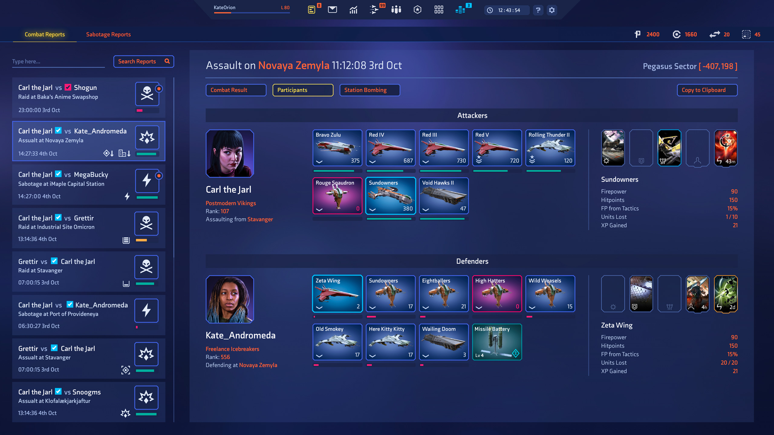
Combat Report
The Combat Report served as an inbox for all warfare and espionage involving a player’s fleets and stations. Reports were tabbed to show the overall outcome, detailed fleet actions, and any damage sustained by stations. A sidebar highlighted the engagement type such as sabotage, assault or raid, making events easy to scan and prioritise. The design presented complex battle data in a structured and readable way so players could act quickly.
Logo Design / Iconography
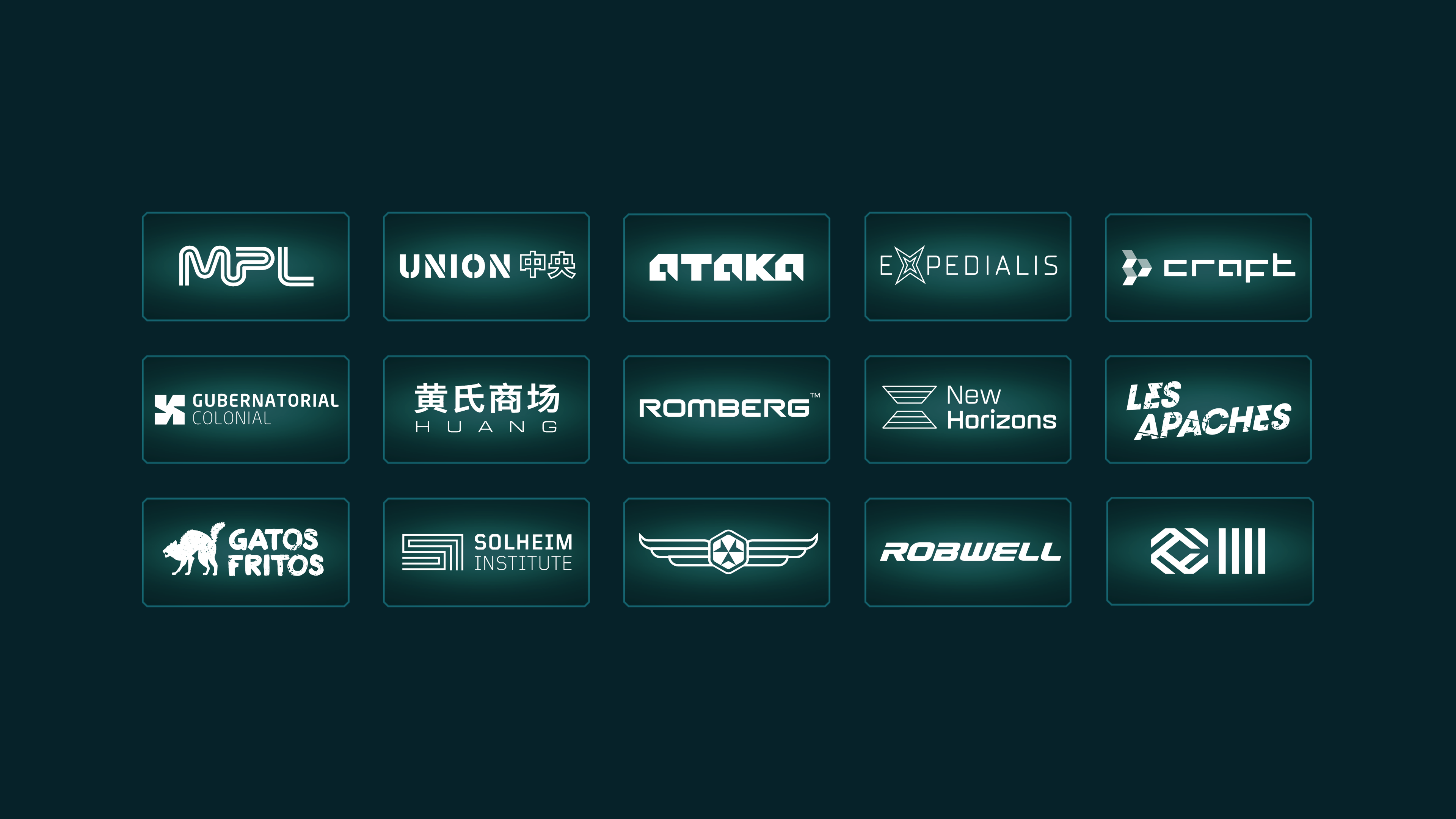
This part of the project offered space for creative exploration. The green logosheet shows a range of marks designed to represent the many corporations and organisations within Starborne, from freight haulers to explorers to mercenaries, each tied into the game’s extensive lore.
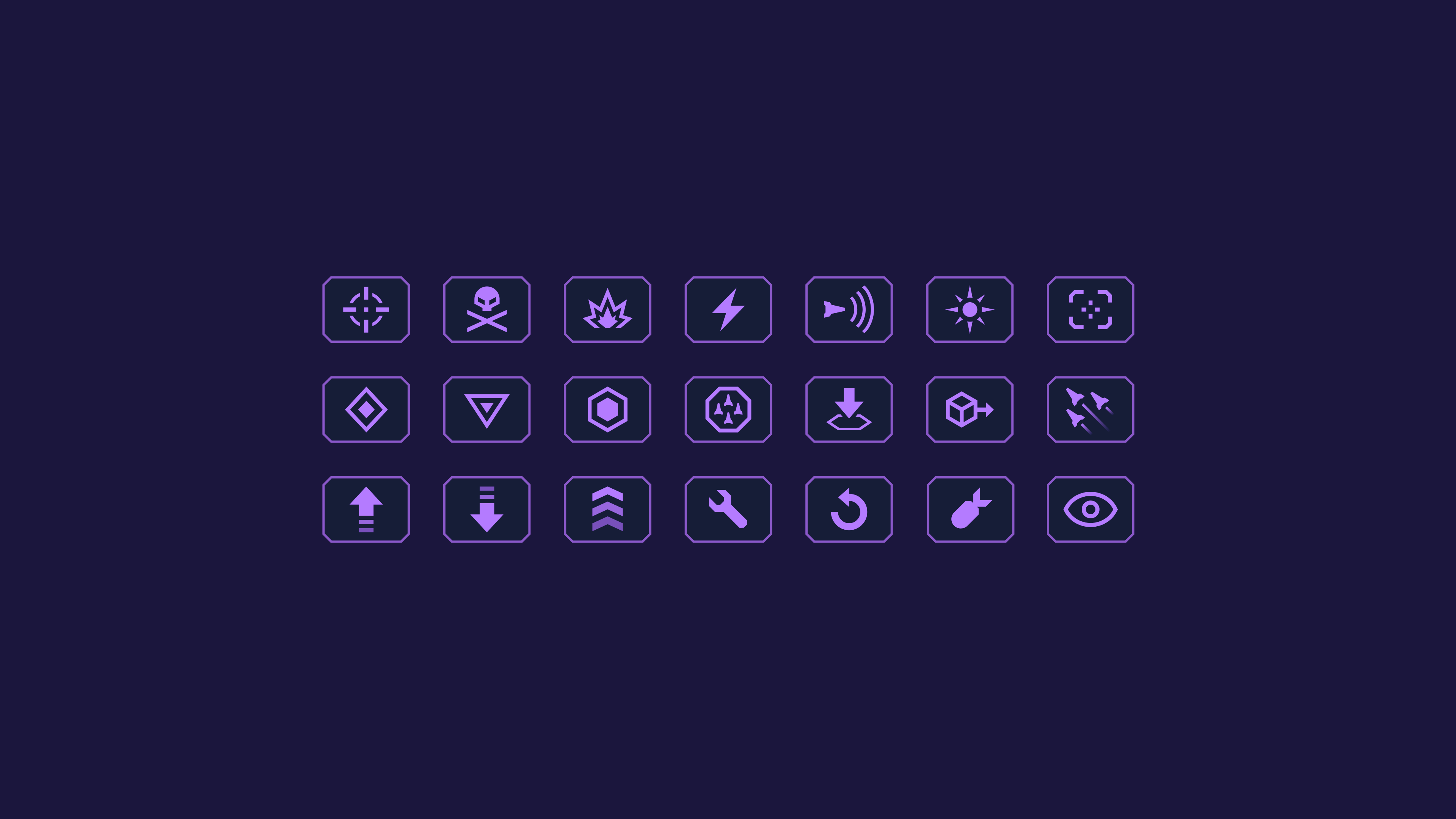
The purple iconography sheet displays fleet action symbols, used as labels across the map. These icons were colour-coded to distinguish the player’s fleets, allied support, and incoming attacks, giving players immediate situational awareness.
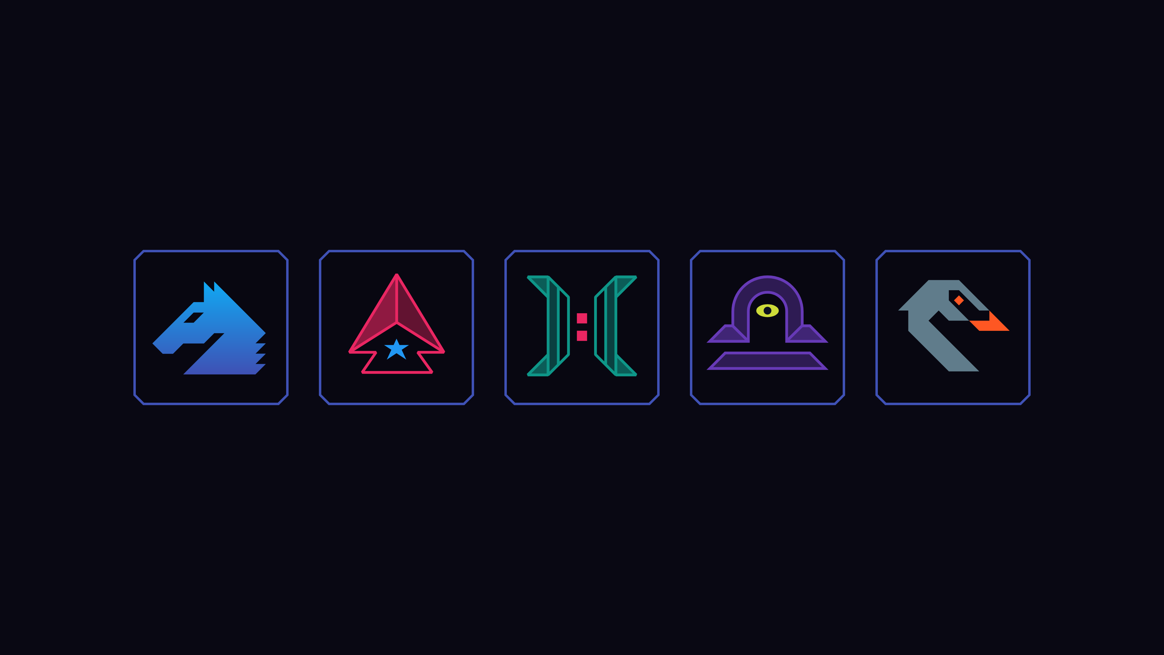
Finally, the sector crests illustrate the identities of the starting regions. When beginning a game, players selected a sector to spawn in, each defined by unique strengths and drawbacks. The crest designs were inspired by traditional Latin constellations such as Gemini and Cygnus, grounding the science fiction setting in a familiar symbolic language.