Heaven's Playground
Heaven’s Playground was a collaborative fashion project I worked on with textile designer and artist Sarah Jackson back in 2011. The idea was to create fantastical imagery and designs that felt as if they’d been summoned from another realm - Heaven’s Playground.
My role was to produce the graphic artwork used for pattern and print making. Much of my inspiration came from retro 1980s arcade marquees and logotypes: bold geometric shapes, electric colour palettes, chunky sci-fi type, and confident line work, all infused with a sense of playfulness.
Looking back, I think the work still feels surprisingly fresh today, and it’s certainly a big departure from my day-to-day practice as a UX/UI designer. With that in mind, I thought I’d share some highlights.
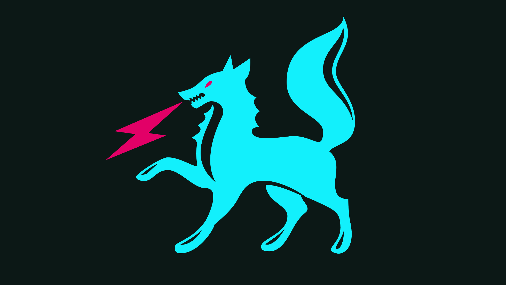
So then, the first of two primary designs that were later screen-printed onto a limited run of t-shirts. For this design I adapted the coat of arms of the Russian town of Salekhard, situated on the Ob River in Russia’s far north. I’ve always had a fascination with remote places, as well as the graphic symbolism of crests and coats of arms (particularly Eastern ones).
I imagine this is meant to be some sort of Siberian Husky, although I redrew it to look more demonic and, of course, added the bolt of electrified plasma. There’s a enticing sense of chaotic energy to it, much of which comes from the prancing stance of the original illustration.
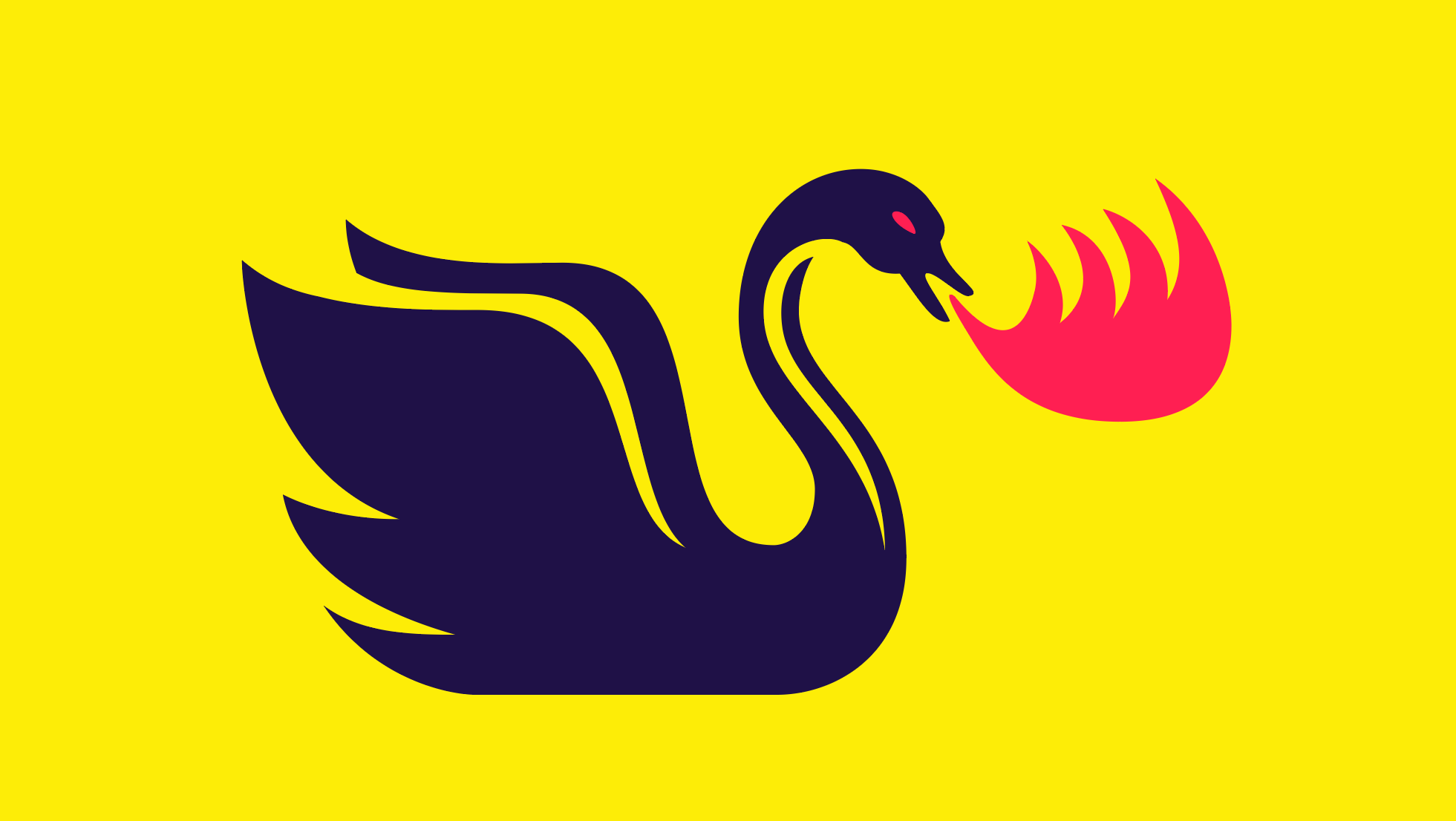
Next up we have the Fire-Breathing Swan, based on a detail from the cover of Merlin’s Ring, a vintage fantasy novel by H. Warner Munn. This illustration I drew entirely from scratch, and perhaps lacks some of the dynamism of its hellish sibling, but I feel still forms a solid companion within the set.
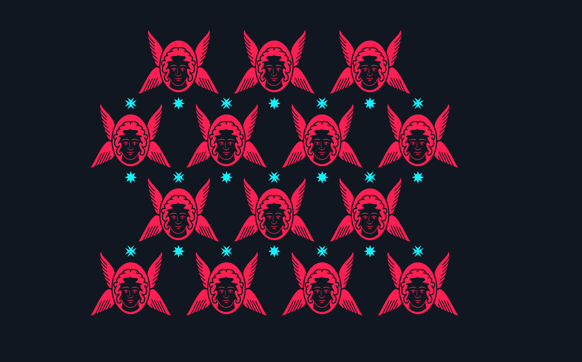
Beyond those initial two designs, much of the other artwork remains unfinished, though I’ve pulled out this angelic pattern to give a sense of the trajectory. It has something of a ZX Spectrum vibe, almost sprite-like, perhaps.
And finally, though not strictly connected to Heaven’s Playground, I’ve included a logo design created for Sarah’s reconstructed fashion project, Worn Reborn. The styling carries a similar energy. The logotype elements were based on the reconstructive process itself, with button, hemming, and zip-like letterforms.
I’ve designed many logos over the years, including one for the billion-dollar US company Postmates (more on that in a future post), but this one remains a favourite.